...
...
HIGH-LEVEL FLOW
Collaborators:
...
Responsible
...
Flow
...
...
1
...
Start a component proposal
Identify new UI need and define the use case in a Google form submission or a Component Proposal. Bring it to the UI design team and #paragon-working-group to determine if it should be added to Paragon or a one-off solution.
...
...
Expand proposal into a component spec
Share the spec with the #paragon-working-group
...
...
...
Implement the component spec
Publish the design, as well as UI, UX, and dev documentation. Request QA of the implementation.
...
...
4
...
QA the implementation
...
...
5
...
Finalize the implementation, UI UX doc, and dev (technical) doc
Announce and celebrate!
...
DETAILED FLOW
...
Step 1 – Start a component proposal
...
...
...
...
RESPONSIBLE:
...
If you need help creating a proposal submit a request (via Google form) to work with a
designer.Before starting a proposal confirm that the need is not already supported. Does a
...
new pattern need creating? If there is an existing pattern, does it work for a specific application/use case?
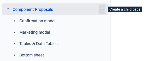 Image Removed
 ...
Yes, it works (stop here if checked, and use an existing pattern)
No, it needs to get modified
Start a component proposal by creating a child page of “Component Proposals”
Use the Paragon Component template when creating the page.
If appropriate, you may create a proposal in Confluence instead of Figma | Create from Template |
|---|
| spaceKey | BPL |
|---|
| blueprintModuleCompleteKey | com.atlassian.confluence.plugins.confluence-business-blueprints:design-component-blueprint |
|---|
| contentBlueprintId | 4046e21f-b32b-4376-884d-b2931f7766c8 |
|---|
| templateName | 4046e21f-b32b-4376-884d-b2931f7766c8 |
|---|
| title | @currentDate Proposal |
|---|
| buttonLabel | Create proposal page |
|---|
|
|
In Figma:
Duplicate the “New Component Template” page in the Paragon 2021 Figma Library
https://www.figma.com/file/eGmDp94FlqEr4iSqy1Uc1K/?node-id=14389%3A446
Rename the page to the name your new component plus a 🚧 emoji.
The 🚧 emoji to denotes that the component is a proposal that is still in draft.
Put the page in alphabetical order.
Design your component, including any documentation needed to describe its function or annotations for engineering to get it built.
The proposal should start as a
. Work through the proposal states below to take your proposal from to | Status |
|---|
| colour | Blue |
|---|
| title | READY For Review |
|---|
|
to | Status |
|---|
| colour | Green |
|---|
| title | APPROVED TO ADD |
|---|
|
.
| Expand |
|---|
| title | See details on proposal states |
|---|
|
State | Description |
|---|
| The proposal is just an idea. Discussions on the draft serve to gather feedback and help prepare the idea to be | Status |
|---|
| colour | Blue |
|---|
| title | READY For Review |
|---|
|
. | | Status |
|---|
| colour | Blue |
|---|
| title | READY For Review |
|---|
|
| The proposal is ready for a review when it has: |
|
...
A succinct use case and purpose |
|
...
Similar components in edX or in the wild (links)
...
At least a wireframe
...
, a general description of behavior or variants, and a design reflected in at least a wireframe level fidelity. Proposal Reviews start in person in the Paragon Working Group meeting and continue on Slack if needed. To get on the meeting agenda make a post in the #paragon-working-group channel on Slack. The group will consider the following: Review the use case from the and perspectives and come to an understanding of the need.Should this component live in Paragon? Determine if the use case is unique. If so, it should remain be a one-off solution. Do we agree on what to name this component?
Reviews |
|
...
move the proposal to | Status |
|---|
| colour | Green |
|---|
| title | APPROVED TO ADD |
|---|
|
, , or | Status |
|---|
| colour | Purple |
|---|
| title | NEEDS CHANGES |
|---|
|
| | Status |
|---|
| colour | Green |
|---|
| title | APPROVED TO ADD |
|---|
|
| An accepted proposal is ready for further design and engineering work. A proposal is accepted with three approvals (minus the proposer), one from each UX, UI, A11y, and Eng. Once accepted the proposer should begin building out the component spec with UX/UI/Eng/A11y (if they have not already). | | A deferred proposal should be designed and built as a one-off where it is needed. Move the proposal to a new folder in this space (TODO: when this happens the first time add a folder in the wiki in an appropriate location) | | Status |
|---|
| colour | Purple |
|---|
| title | NEEDS CHANGES |
|---|
|
| A proposal needs changes to become | Status |
|---|
| colour | Blue |
|---|
| title | READY For Review |
|---|
|
again. |
|
...
Step 2 – Get your proposal approved at the Paragon Working Group
RESPONSIBLE:
...
...
Step 2 – Create a component specification
...
...
...
Share your proposal with the #paragon-working-groupat the weekly Paragon Working Group Meeting to determine if it should be added to Paragon or a one-off solution.
Update the proposal to reflect that the proposal has been approved
...
Step 3 – Complete the component design specification
RESPONSIBLE:
...
...
...
Develop the proposal document (ideally in Figma) into a full component specification. If you need help developing the component into a complete spec here are sources of support:
Share the component spec in the #paragon-working-group channel.
...
Step
...
4 – Create a Jira ticket to implement the component
...
...
RESPONSIBLE:
...
...
...
...
...
Based on the design doc from the previous step:
...
: Implements the proposed design and creates dev doc...
: Updates the design docStep 4 – QA the implementation
...
| Note |
|---|
Engineering resourcing for implementing Paragon components is currently ad-hoc. Squads that need the component are ideally responsible for the work, but some times it’s too much work to take on in the near term. This is an ongoing challenge to be aware of. |
Add a ticket to the Paragon Backlog that outlines work to implement the proposed design (add a link to the proposal) and create a technical doc page.
Add a link to the Jira ticket in the Figma or Confluence proposal.
...
Step 5 – Implement the component in React
RESPONSIBLE:
...
...
...
...
QA: Identify bugs and design/implementation issues
Async: Use the #Paragon-working-group slack channel to review the implementation asynchronously
...
| Tip |
|---|
Tip: Before you start implementing your component, it us helpful to write example of how you would want to use this component as if you had already written it then and share that with others. Getting feedback on props api or component naming early on can reveal key concerns you may have missed and save time. |
Implement the component. See this video for a technical walkthrough for getting started developing for Paragon: Writing a React component for Paragon (Study Group 1-26-2021) and this document for React Component Design Tips & Tricks
Send a link to the component proposer for QA. When the Jira ticket is ready for review the engineer responsible for the work should sends a link to the proposer of the component for review. The Paragon github repo creates deploy previews of pull requests. These links are useful to send for QA.
...
Step 6 – Finalize the design and technical documentation & 🥳
...
...
...
...
...
Based on the QA findings from
...
design
...
...
- : Fixes bugs/design implementation issues, and ships.
...
...
- : Makes any needed updates to design spec for documentation
...
...
Announce and evangelize the new design pattern throughout edX!
Share in Slack channels (
...
#fedx and #experience_team)
Have a drink or two (2 drinks per pattern
...
is the recommended amount of drinks)